I recently visited the Albright-Knox art gallery located in Buffalo, New York. While visiting I saw a lot of very different creative pieces of art. Some that intrigued my to learn more, some that told a story, some that were difficult to understand, but overall it was a great time. There are some amazing artists featured in this gallery, and all of the works of art were beautiful to look at, and try to understand. The first work of art that made an impression on me was Frida Kahlo's self-portrait with monkey (1938).
 |
| Frida Kahlo's Self-portrait with monkey (1938) |
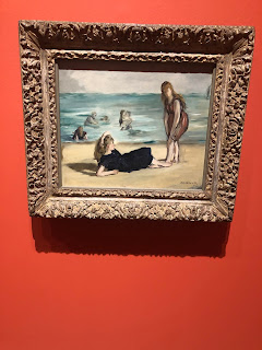
Another piece of art that made an impression on me was Edouard Manet's On the Beach (1868). This is because it reminded me of when I was younger, and my sister and I would go to the beach with our father. We would play on the sand for hours, and this painting took my thoughts back to a significant time in my life.
An artwork that I felt connection with was Stuart Davis's New York Waterfront (1938). I felt connected to this painting because it reminds me of home. I am from New York city, and we have many significant water fronts. This reminded of the promenade by the east river that is very close to my house. another painting I felt connected to was James Ensor's Le Feu d'artifice (Fireworks) (1887). This was because I feel like it represented a mood, and the vibrant colors of yellow, orange, and background shouted out to me. It represented an upbeat, excited mood.
 |
| Edouard Manet's On the Beach (1868) |
An artwork that I felt connection with was Stuart Davis's New York Waterfront (1938). I felt connected to this painting because it reminds me of home. I am from New York city, and we have many significant water fronts. This reminded of the promenade by the east river that is very close to my house. another painting I felt connected to was James Ensor's Le Feu d'artifice (Fireworks) (1887). This was because I feel like it represented a mood, and the vibrant colors of yellow, orange, and background shouted out to me. It represented an upbeat, excited mood.
 |
| Stuart Davis's New York Waterfront (1938) |
 |
| James Ensor Le Feu d'artifice (Fireworks), (1887) |
 |
| Narl Ward's Loisaidas LiquorsouL (2011). |
 |
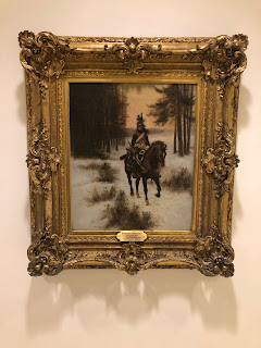
| Edouard Detaille's The Dragoon (1896) |
It's fun seeing everyone else work, because I can see who is interested in what, versus what I am personally interested in. I took pictures of almost all of the same art work. Narl Ward's piece was very interesting to me as well, although I did not use it in my blog posting. Why is it upside down? Why are there flowers? I asked these questions to myself and thought, maybe the flowers mean that there is beauty, and maybe the issue with some humans is seeing too much beauty in alcohol. But that's just my thought! I like that you chose the Self Portrait with a Monkey, because a lot of people are very drawn to that painting as well. I did not know some of that information until I read your blog. You do a very well job at describing your feelings towards a piece. Well done!
ReplyDeleteI enjoy your choice of art from the collection at Albright Knox art gallery. Many of your impressions of these works had the same impressions on me. The one piece that you chose that really stood out was the LIQUORSOUL, Narl Ward, used contemporary americana and turn what some would consider urban blight and a scourge into art. Dressed up in flowers, turned upside down and well placed in the gallery it also caught my attention. Nice eye for identifying different styles of painting like Edouard Detailles The Draggon and Stuart Davis’s The New York Waterfront. Well done.
ReplyDeleteI think you chose a very nice array of art. I especially enjoy the liquor store sign and the piece by Stuart Davis. I think whats important here is the variety and that you were not just strongly attracted to a single aesthetic or quality.
ReplyDeleteI really enjoy how you picked "Fireworks". I think it's such an interesting painting because it always catches my eye and also it doesn't look like fireworks at all. The first few times I saw it, I actually thought it was a volcano.
ReplyDelete